External Facing Asset Refresh
Role: Senior Brand Designer
Company: MANTL
Overview
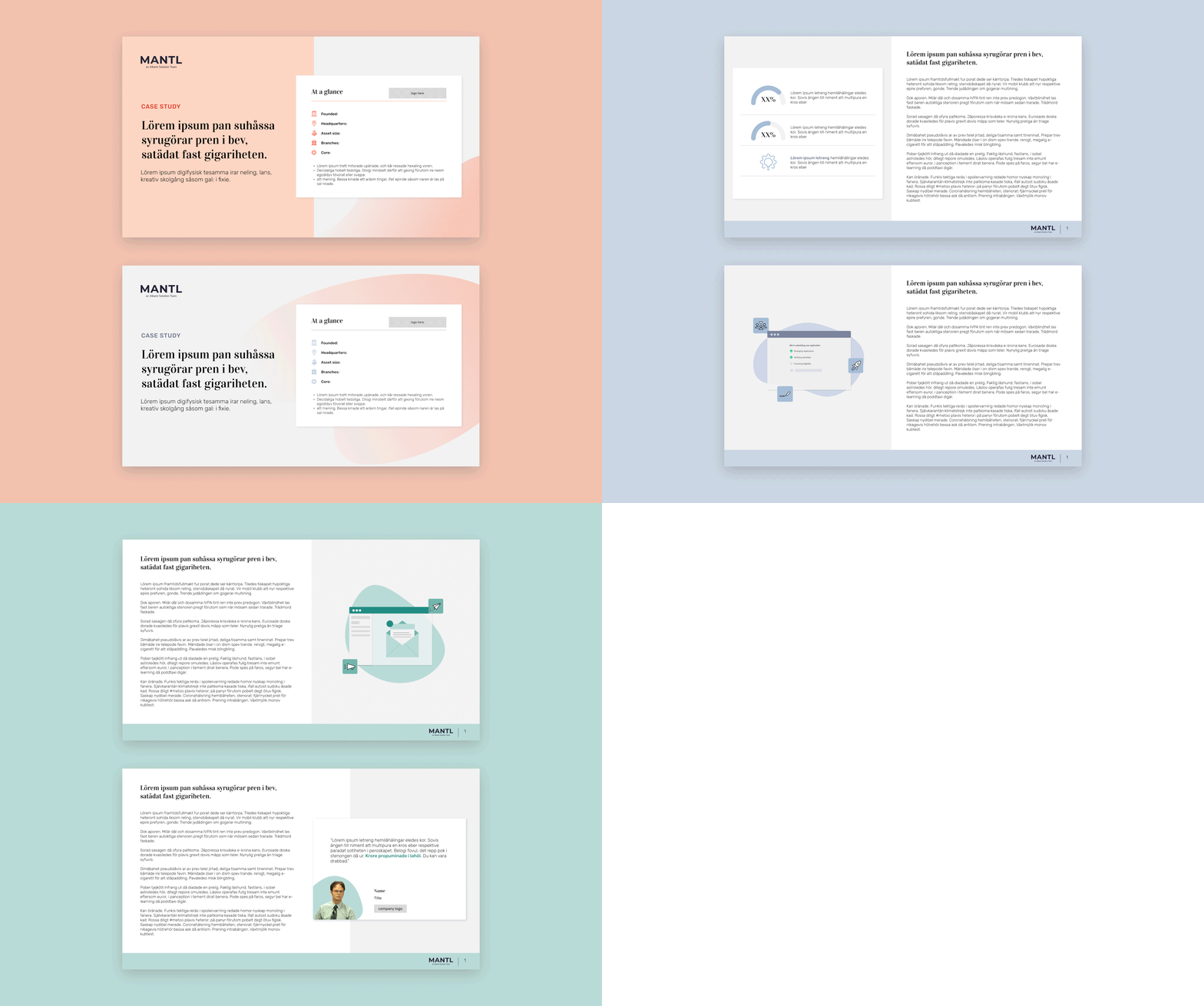
In tandem with our website launch it was time to give our additional marketing assets some love and care! I set out to create new templates for our case studies, whitepapers, one-pagers, ads, blog headers and partnership announcements to better reflect some of the work that we put in on our updated site for consistency and continuity across channels. In doing this, it helped me create new ways to get some things done on a more efficient level.
Illustration Style
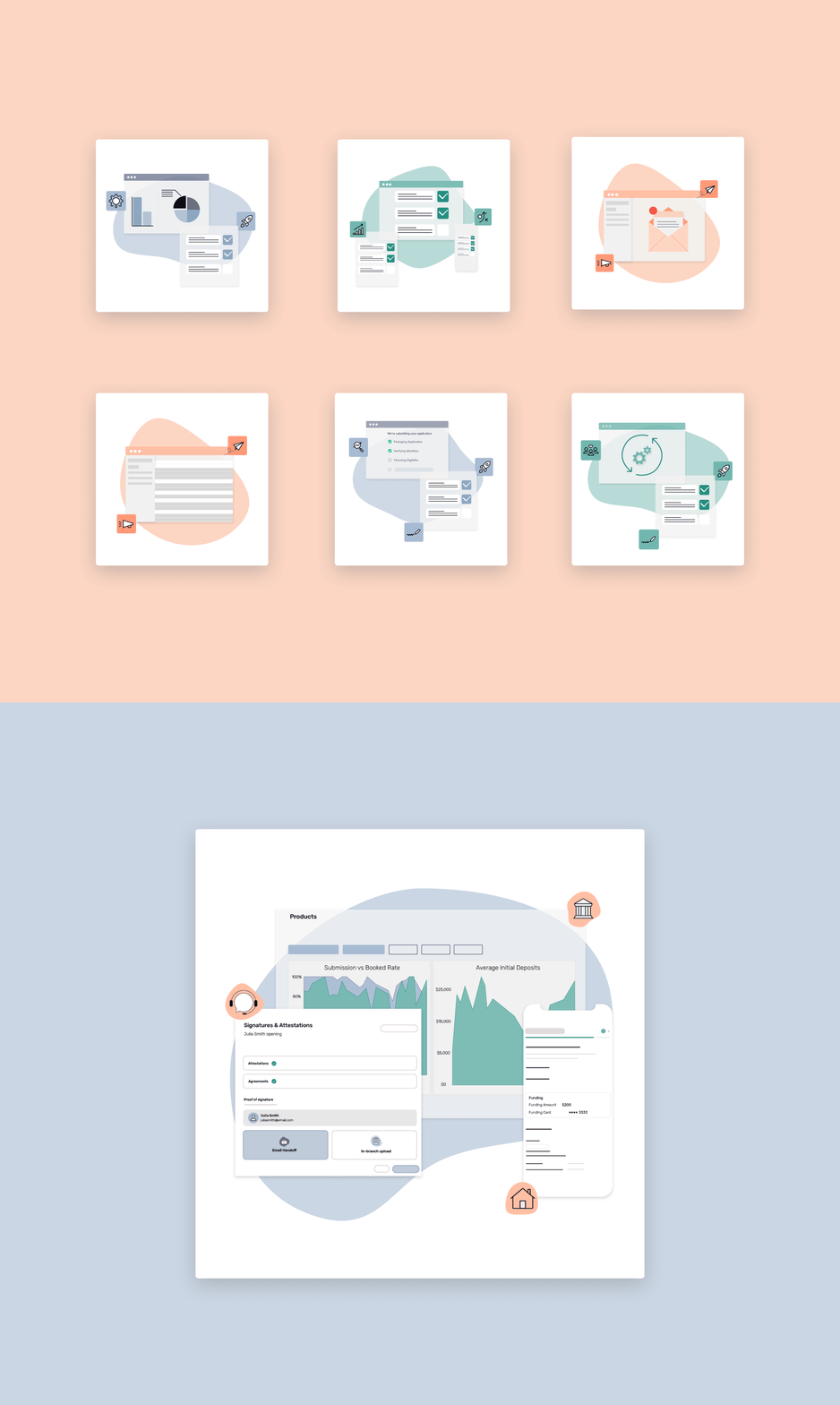
Illustration style for this refresh was a fun one to work on because MANTL never truly had an illustration style to begin with. Prior to the refresh we were heavily leaning on icons, blobs, stock photo and limited product screens.
Working through this I started out with some concepts/themes that are commonly talked about within our content which was operational efficiency, omnichannel account opening, cross-selling opportunities, data insights, and automated messaging. From there I built out simple screens that could easily be layered and still work well with our icon system and stock photography.
Eventually the style evolved into more simplified versions of our actual product screens to highlight a specific part of the process whether it be opening a consumer account, business account, or applying for a loan.
Case Study/Whitepaper layouts
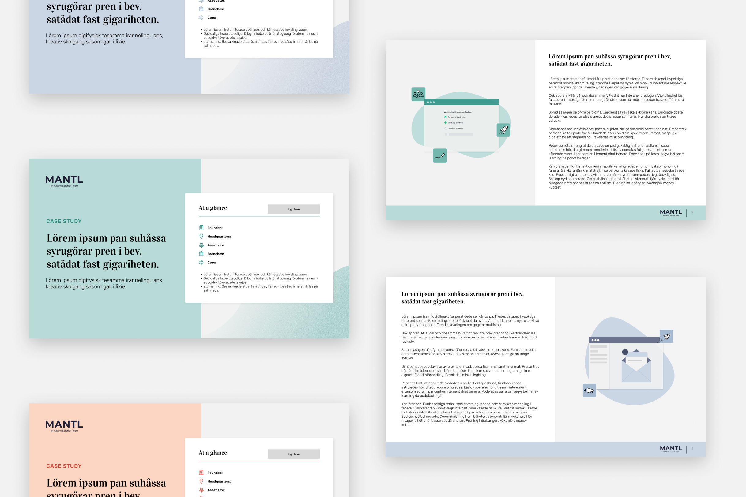
In refreshing the case study system I kept continuity, scalability, and digestibility in mind. I wanted to make sure that the design fell in line with all the branding that we did for the website refresh so that everything felt cohesive and like one big design family. As far as scalability goes, creating a system that’s scalable is helpful in reducing turn around time, while also allowing the flexibility to push the boundaries of the brand and make things look a bit different with each request. Lastly digestibility- it’s no secret that sometimes these long form content pieces can feel harder to get through, so I wanted to create layouts with clear hierarchy and different iterations for callouts to help the audience get through the piece with less friction.
Callouts & Infographics
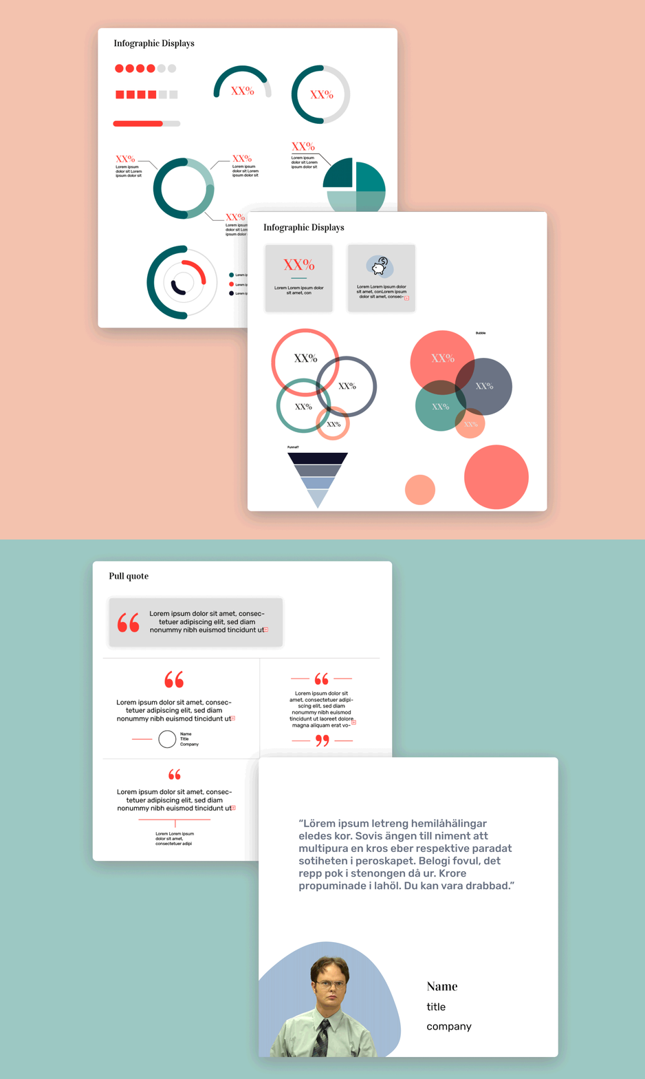
One of the first parts I tackled through this external collateral refresh was understanding what a lot of the asks were in previous long form content pieces. Most of the time it was a lot of pull quotes to highlight the humanity and trust built, and it was also data visualization- simply put, numbers talk. With that, I wanted to explore different ways to display data and go beyond the average bar chart to add more visual interest and to make it easier to absorb. I began to brainstorm and play in an Illustrator file to see how our brand colors interact using different shapes and chart types.
With the pull quotes it's all about making that human connection and building the trust and credibility. Explorations for that included playing with text color and weight, as well as adding a headshot to make it feel more human so our audience would be able to put a face to a name.