

M&K Wedding 2026
Overview
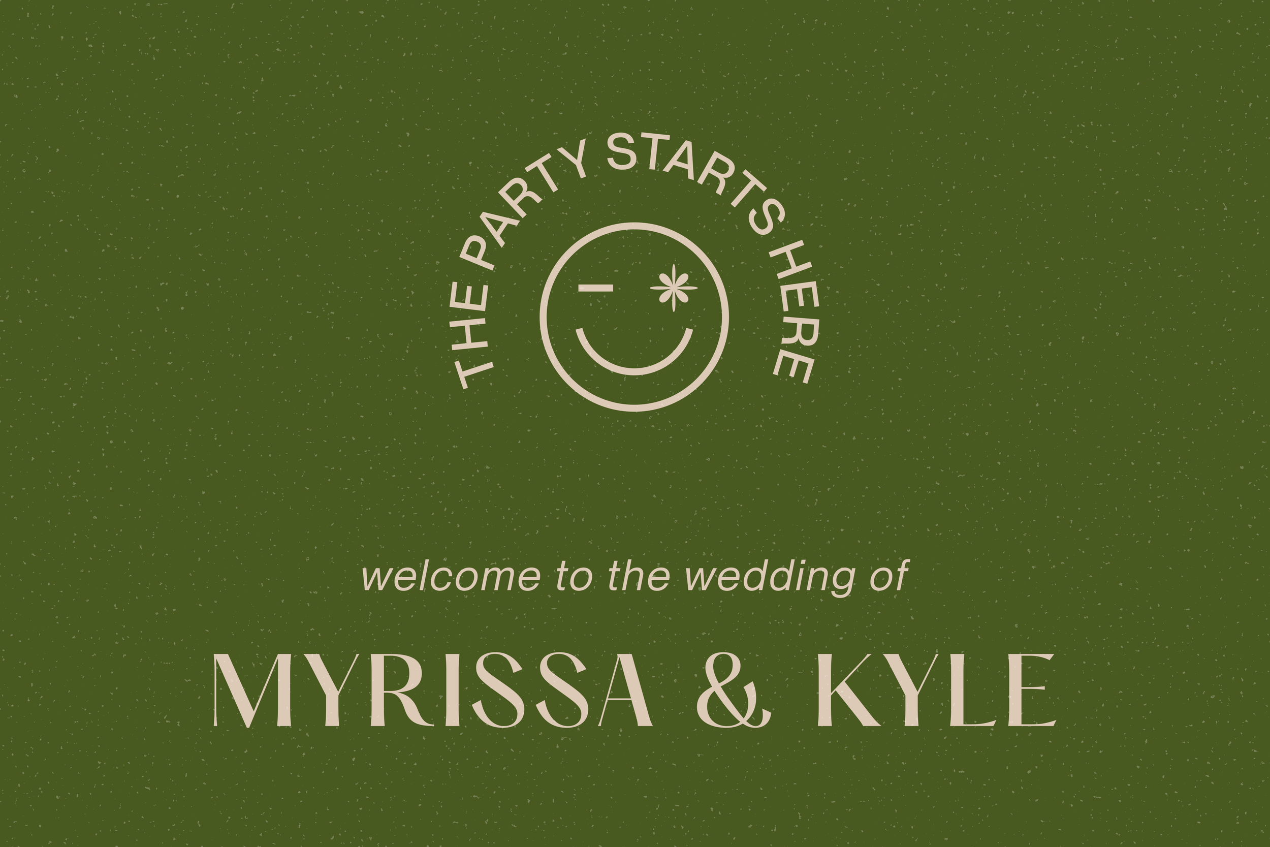
Almost 12 years later, we got married! As we entered our engagement era, we sat down together and talked about what we envisioned our wedding to be, and we landed on wanting to curate a personal and fun experience for our guests. What better place to start our wedding planning than creating a brand identity and general vibe to keep the vision cohesive.
Branding Explorations
One of the first things to nail down before starting on the branding and planning was location. We discussed wanted to do a Palm Springs wedding since we’ve spent some time down there for vacations, hiking and music festivals. Palm Springs is truly a special place for us as we’ve created so many memories there together. (Huge plus points for all the fun mid-century design elements and history in Palm Springs!)
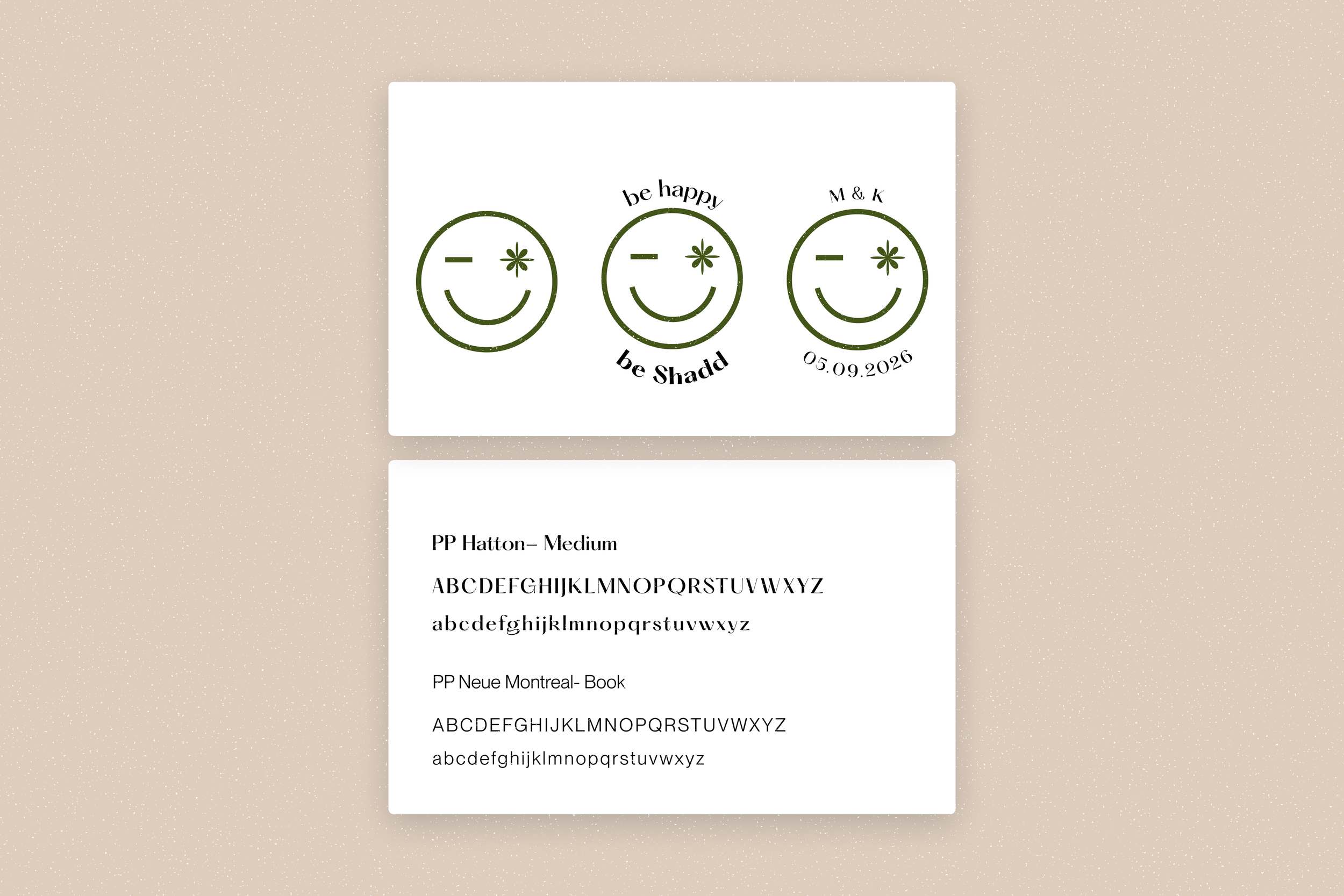
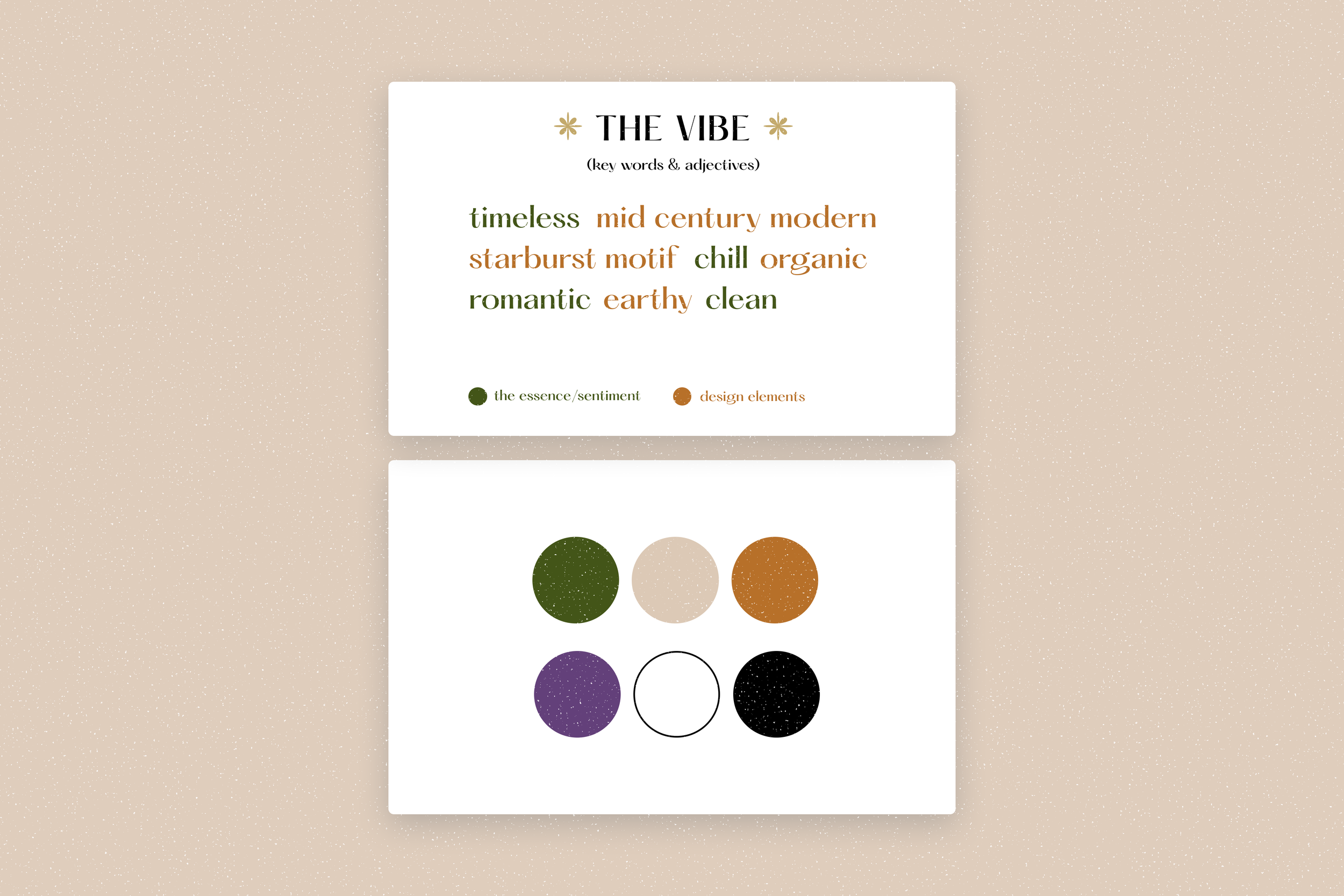
For our branding, I started out with a quick word exercise in what I would want the wedding to feel like and some inspiration to draw from. From there, I started working on the general palette and font family. It was fun to browse through fonts again but I ultimately pulled from our 10 Year Anni magazine branding because I loved the font, it still felt timeless and it’s a nice call back to where we were just a year and a half prior.
For our colors, I wanted to once again, incorporate our favorite colors, but I wanted it to be a bit more elevated and something that could work seamlessly in a desert setting. Additionally to go with the branding, we were thinking about a fun tagline for our wedding and something that’s easily memorable for things like our website password and Ride Share Coupon Codes. So with my husband’s last name being Shadd, we were all in on “Be Happy, Be Shadd.” With that, I wanted to make a fun little motif that would go with the saying which is where our happy face came into play.
Venue
After 3 days of touring venues in Palm Springs, we officially decided on The Drift Hotel. The space was just stunning, and it was so easy to imagine our wedding day there. The ceremony and reception were held on the Desert Lawn which was lined with lighter green cacti and the natural tan color of the desert dirt/sand played so well into our palette. The desert dirt in the space contrasted well with the Olive Green.
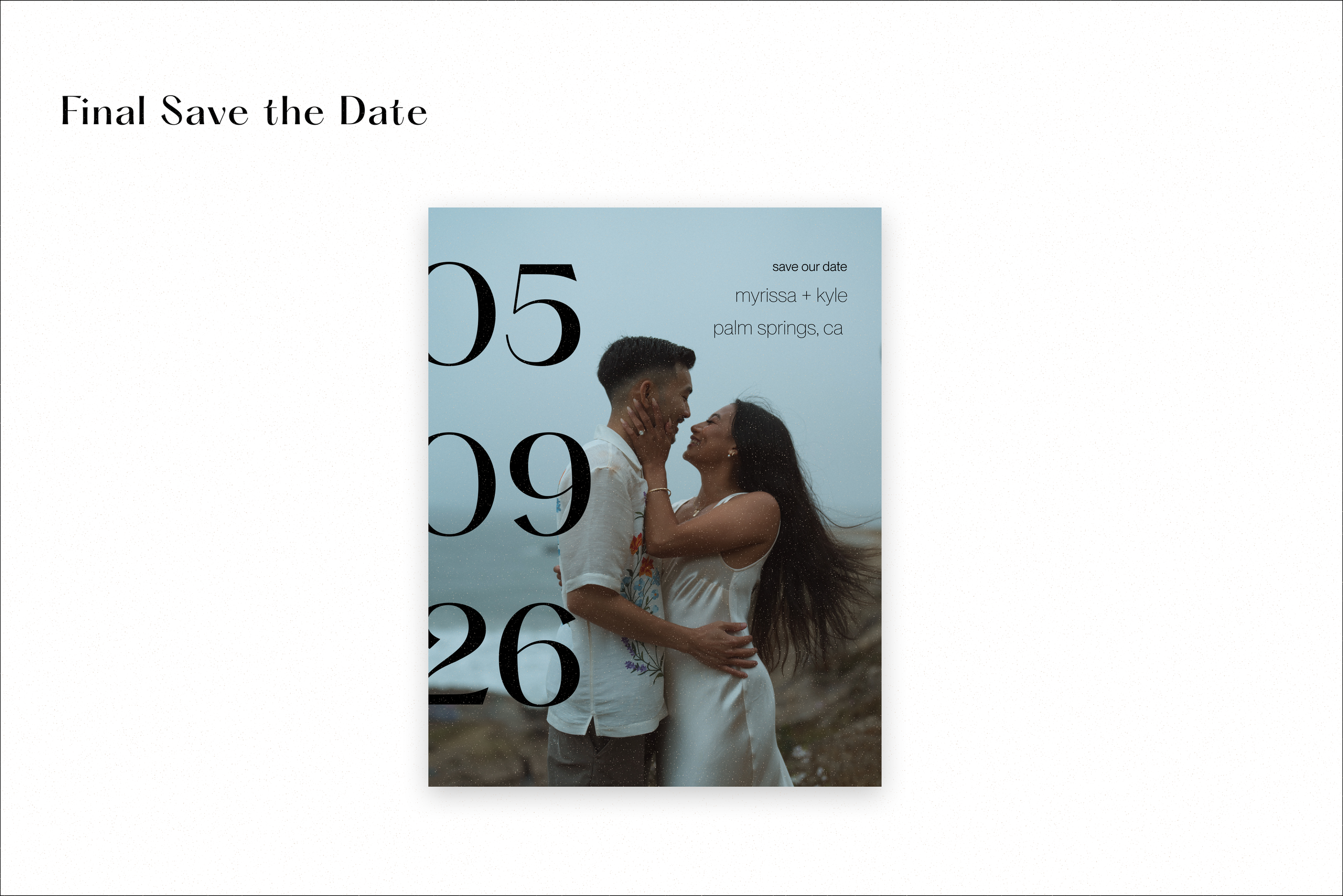
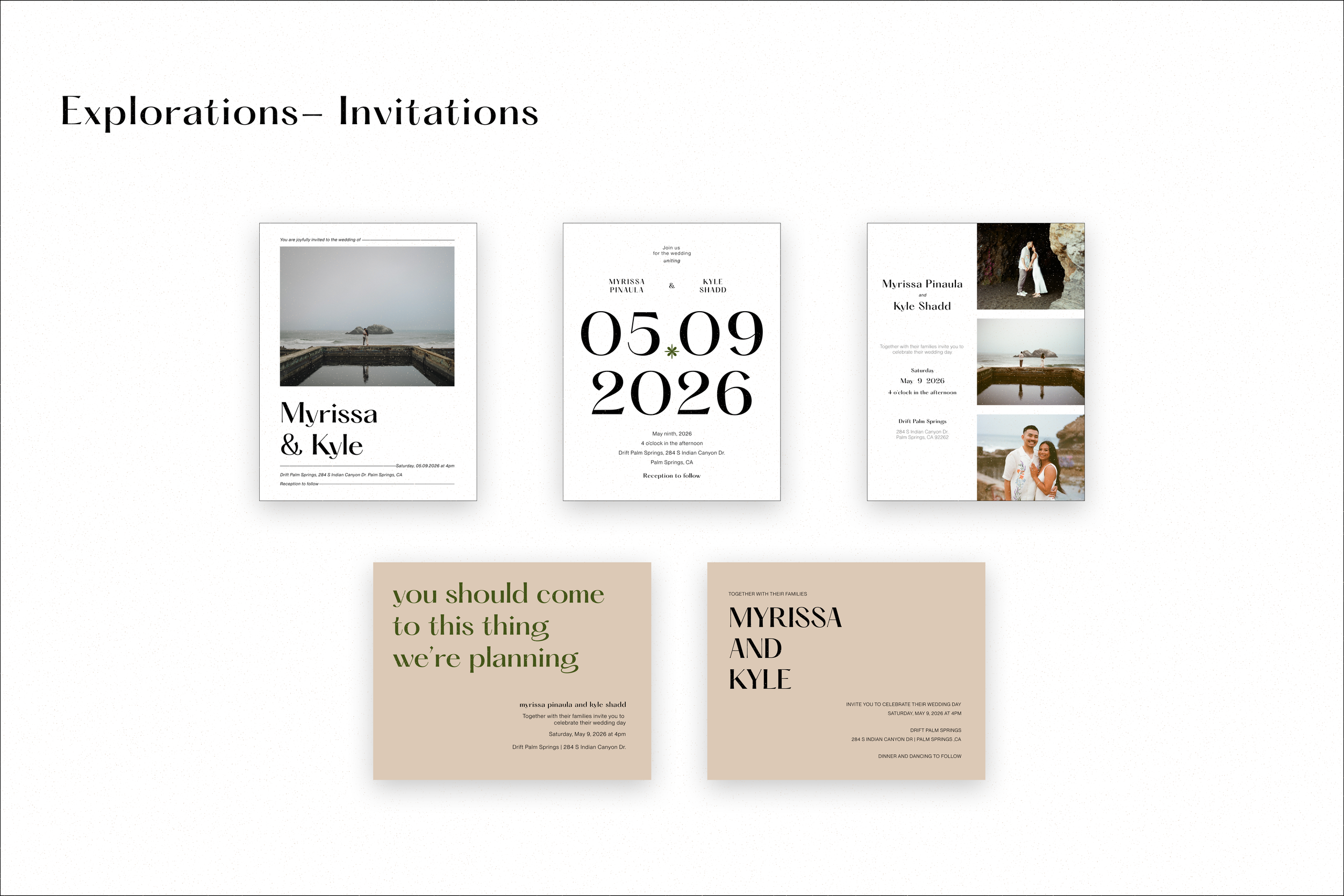
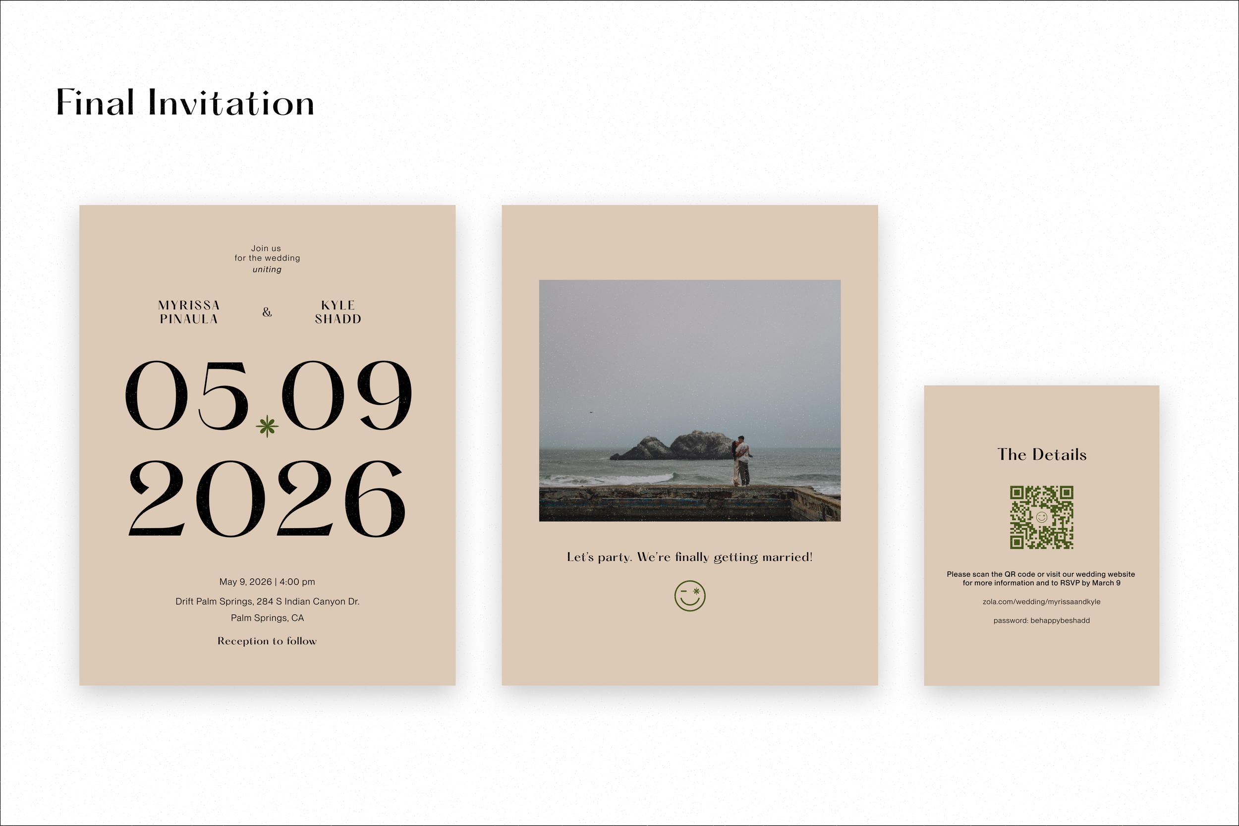
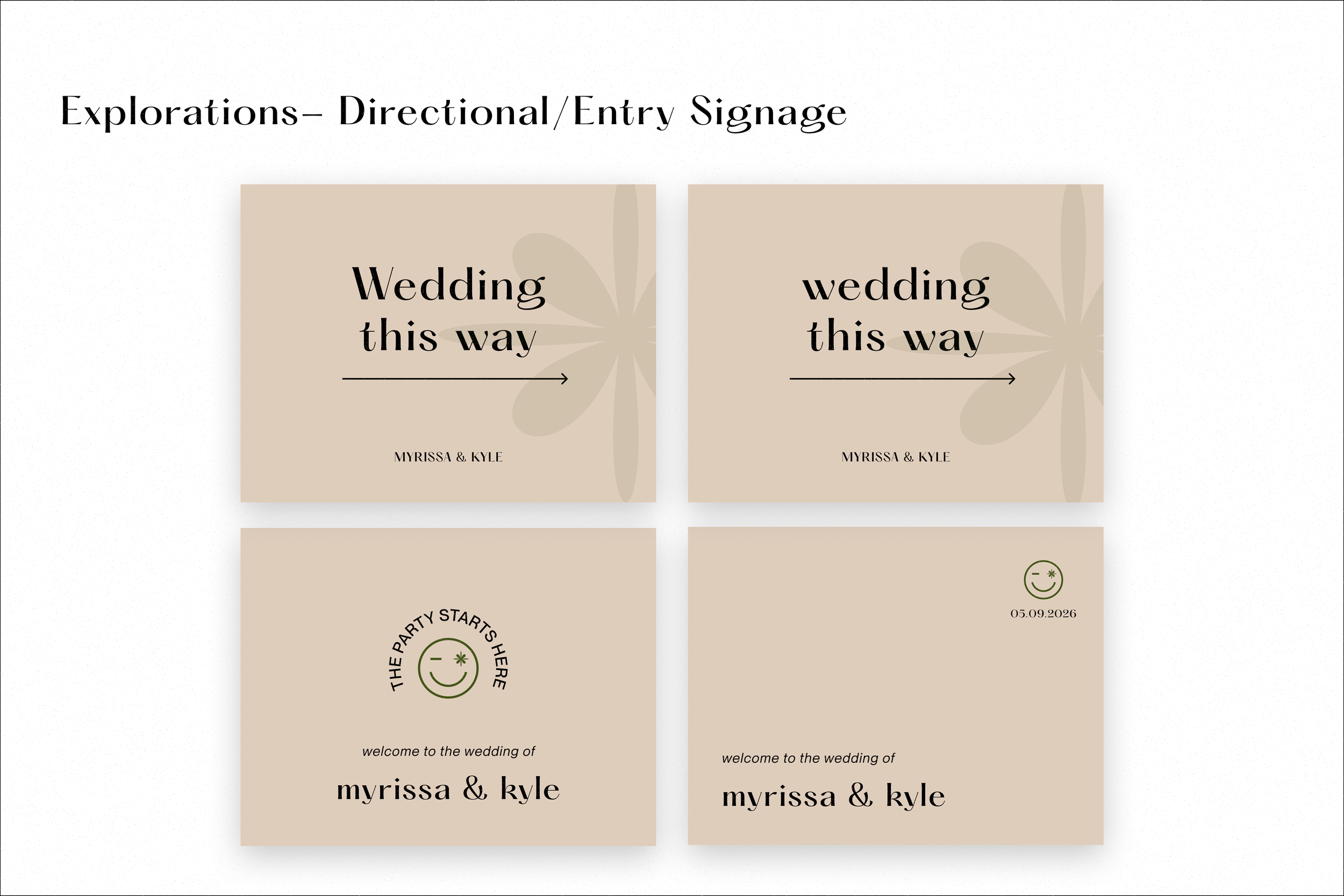
For Print
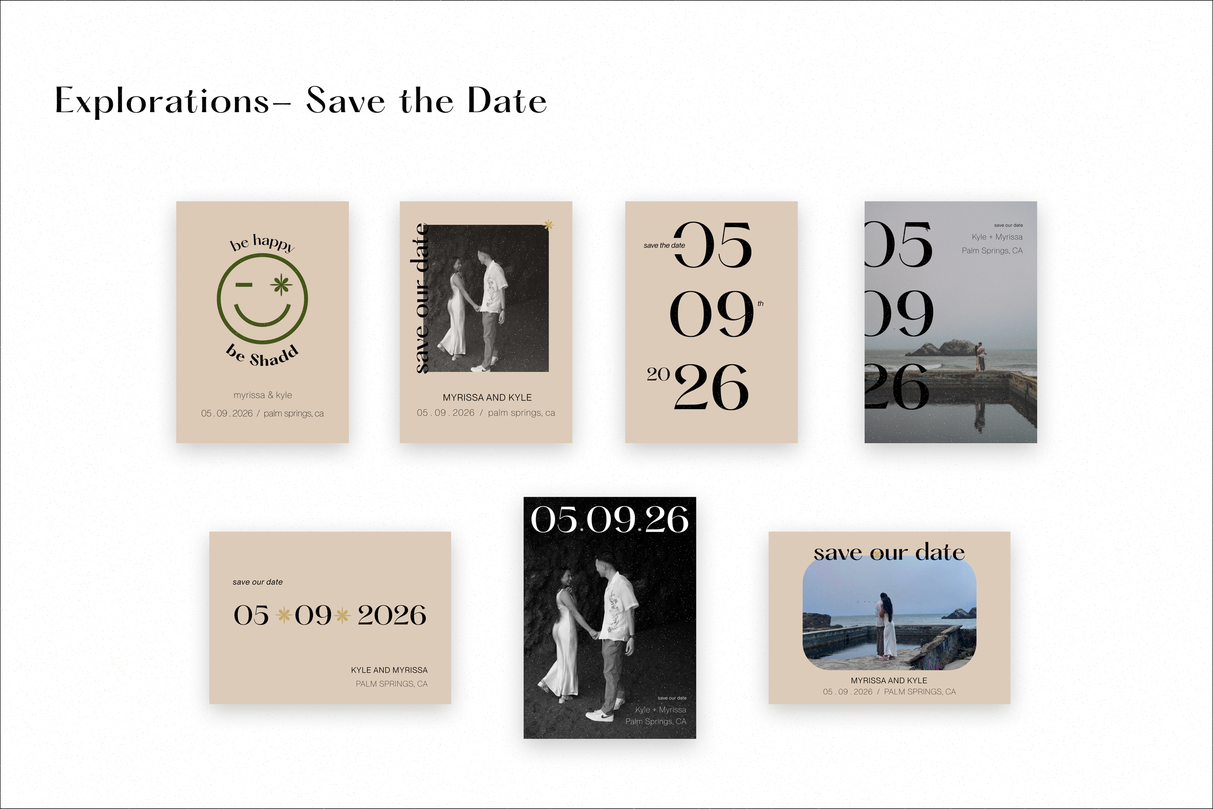
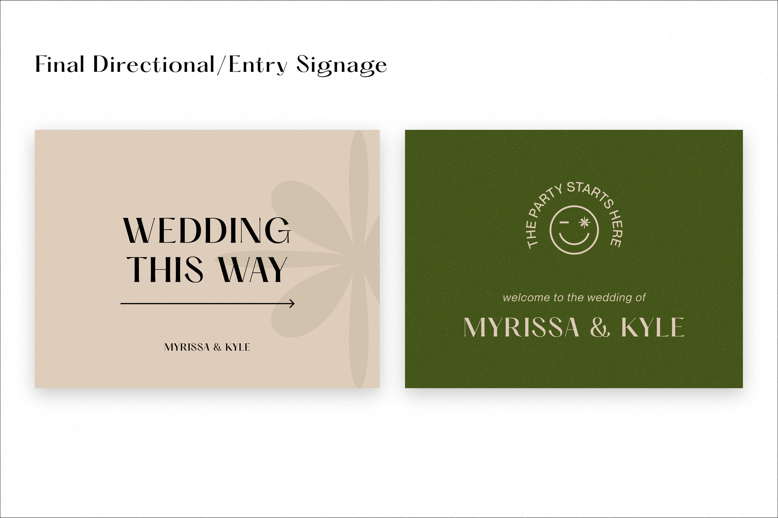
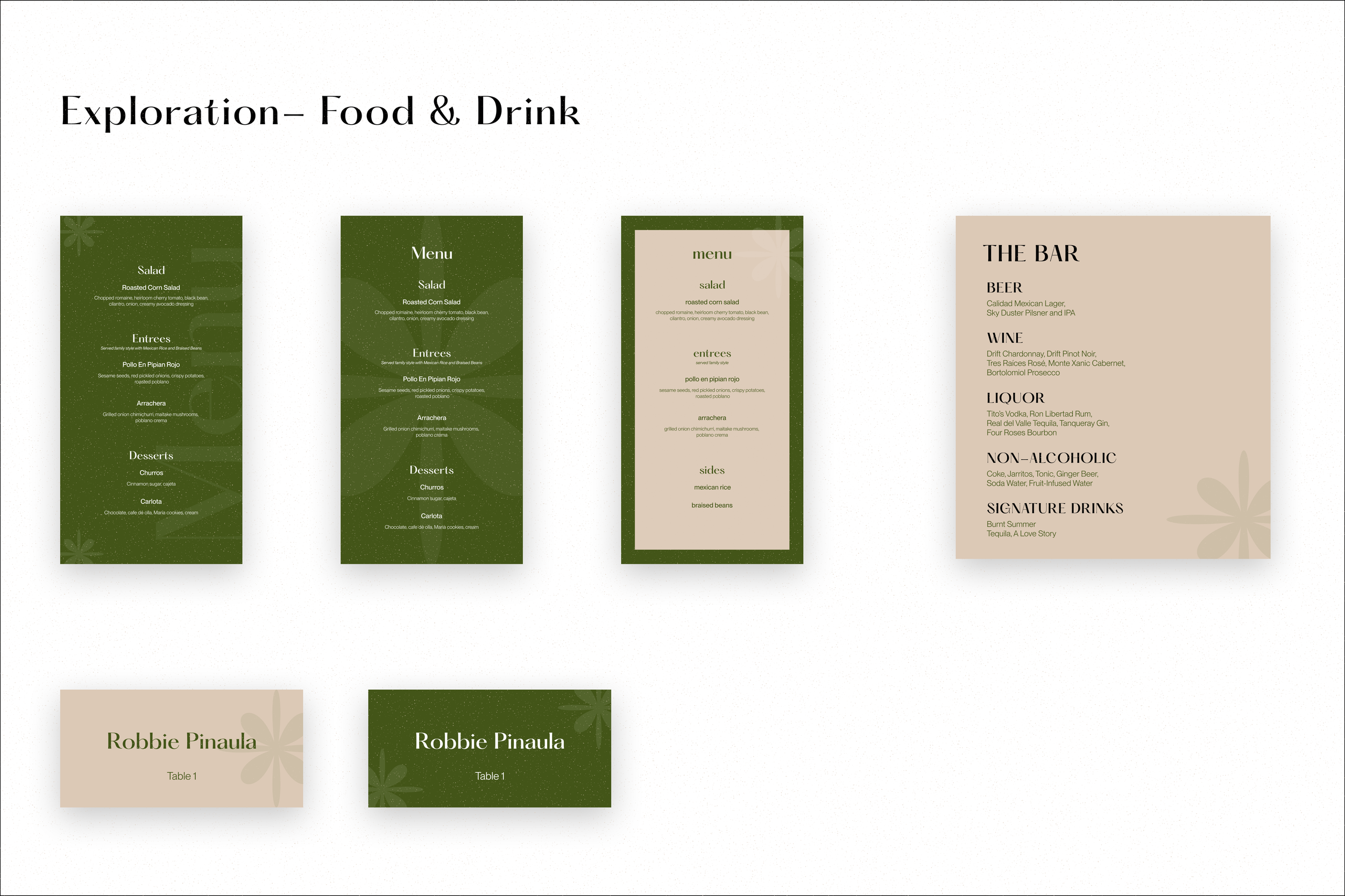
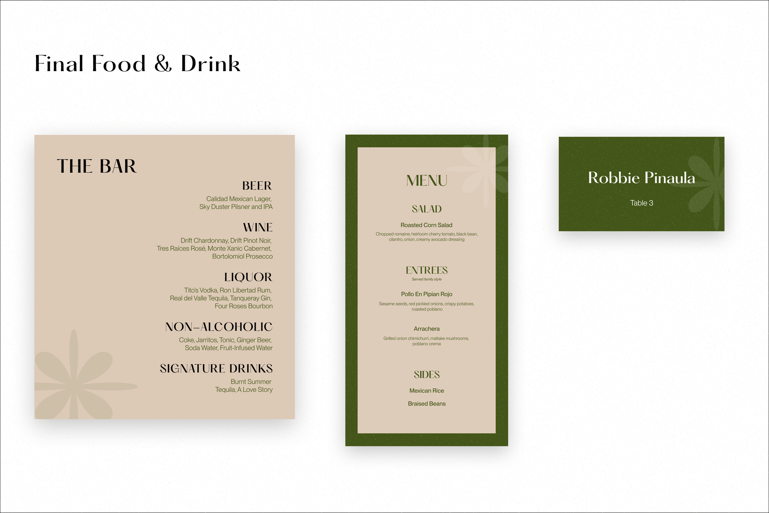
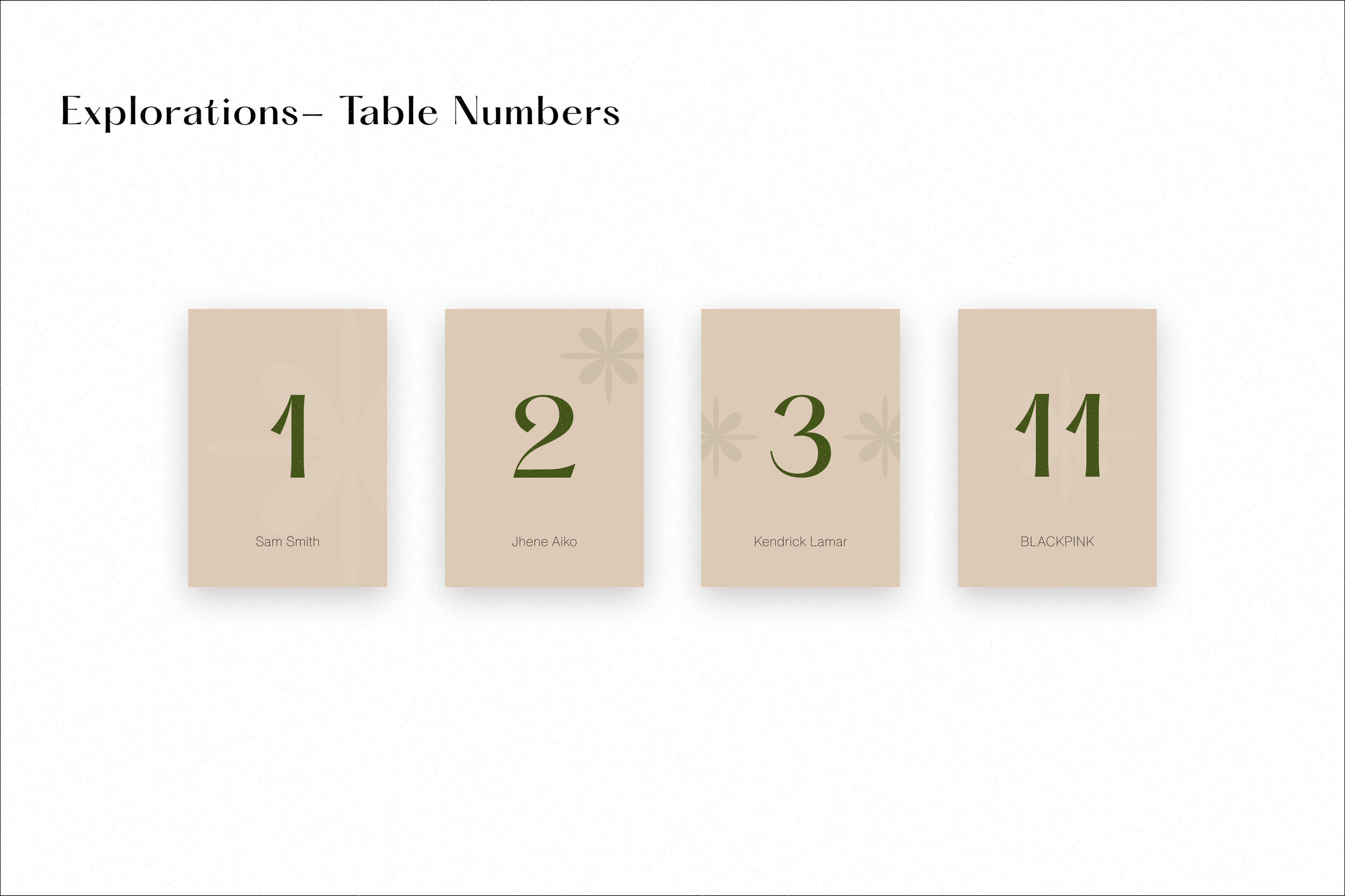
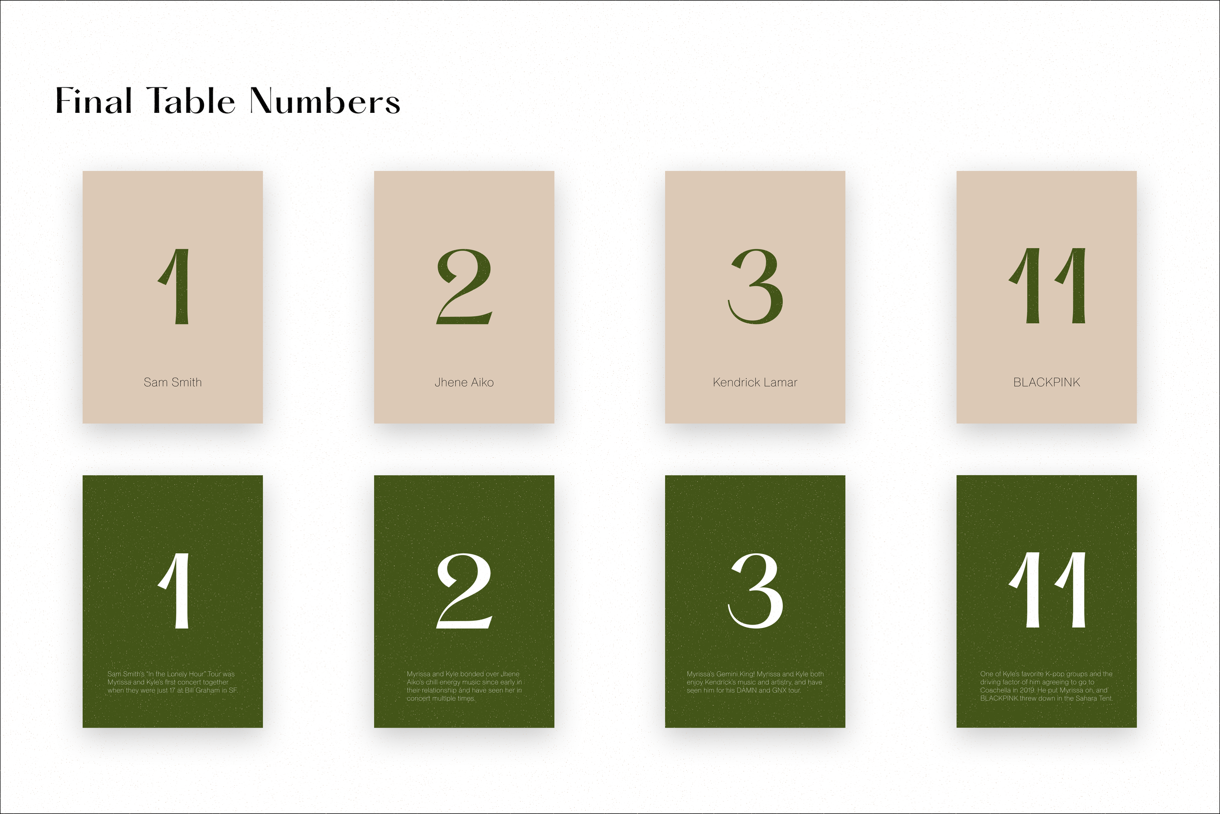
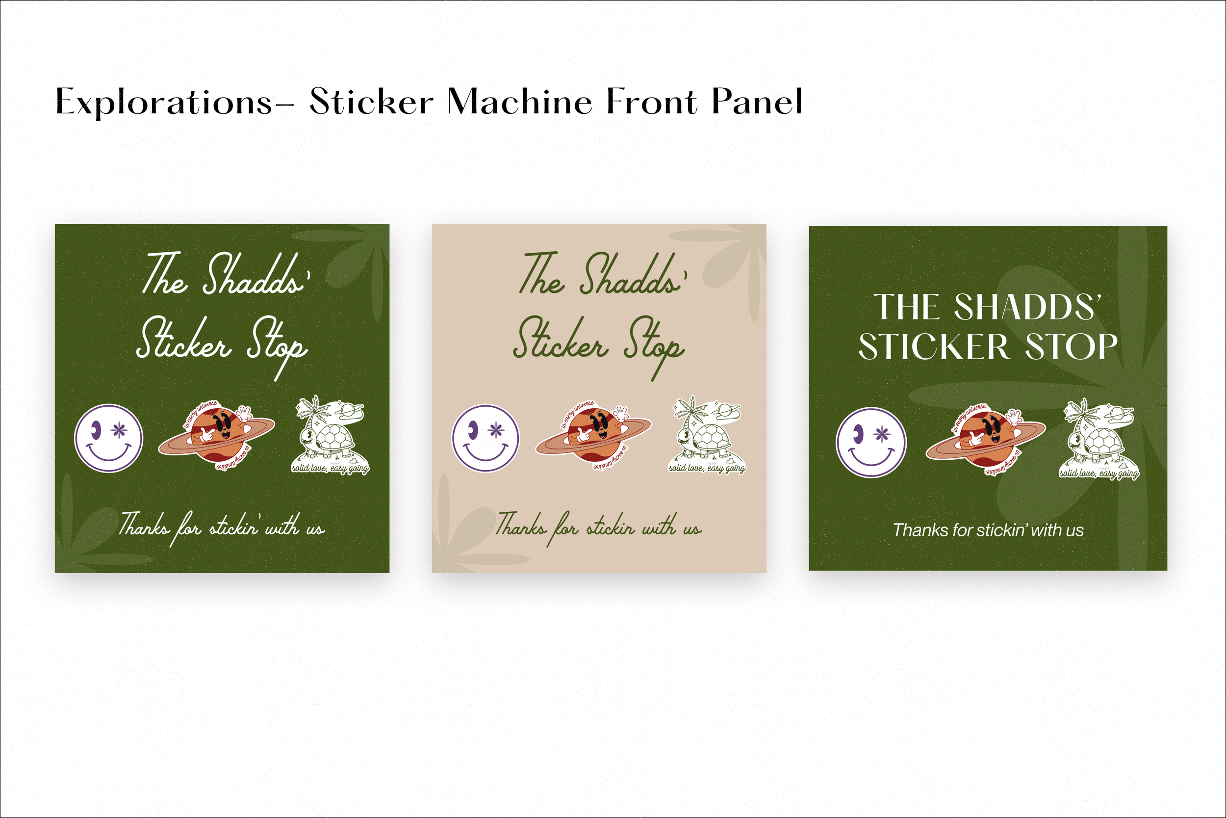
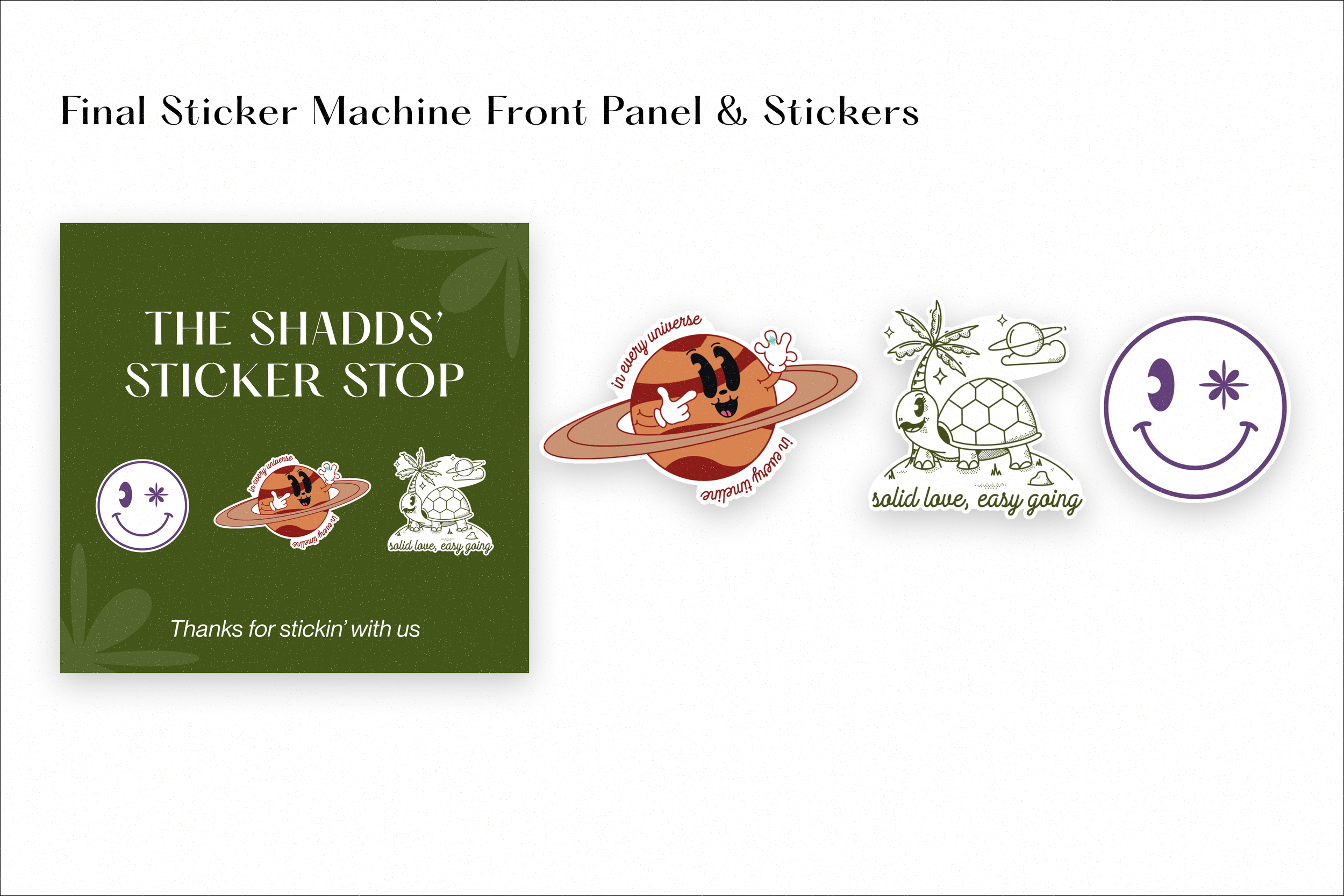
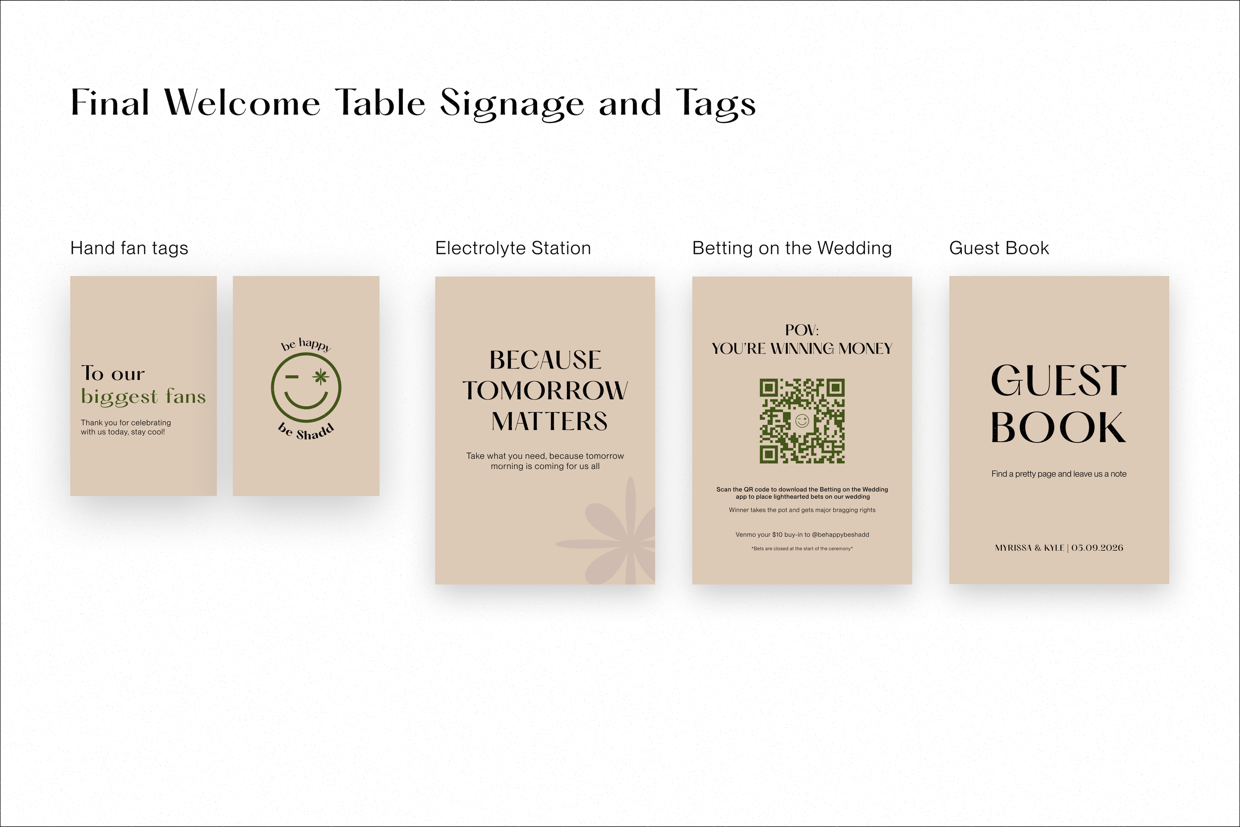
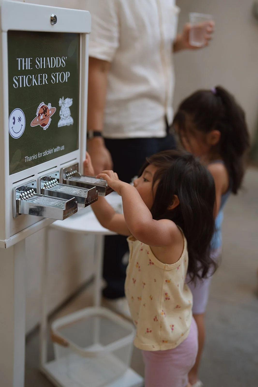
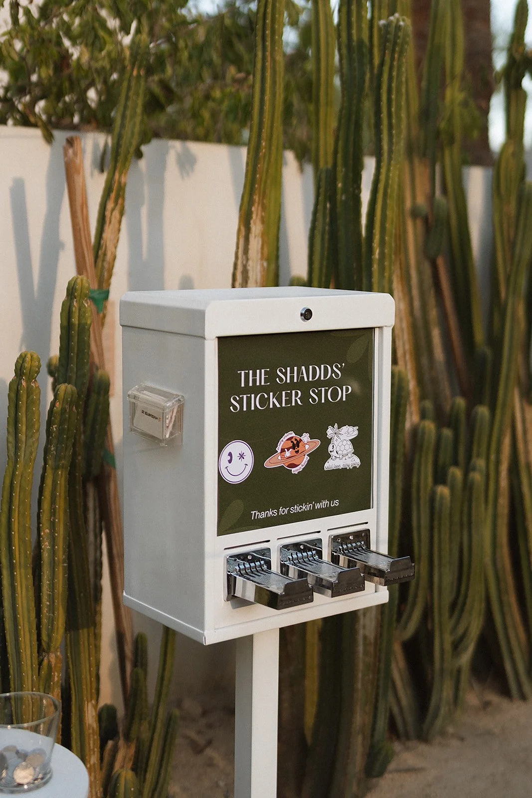
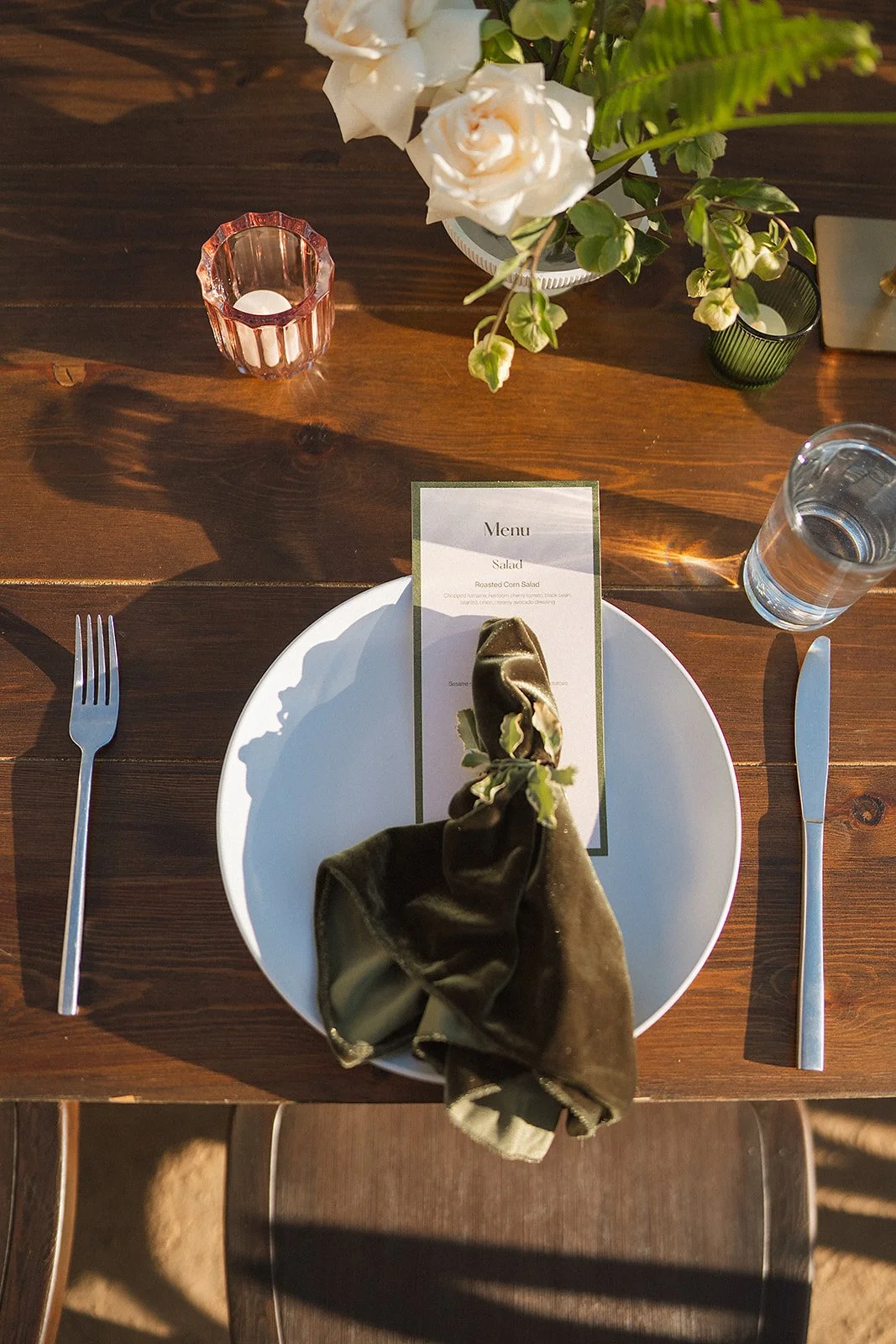
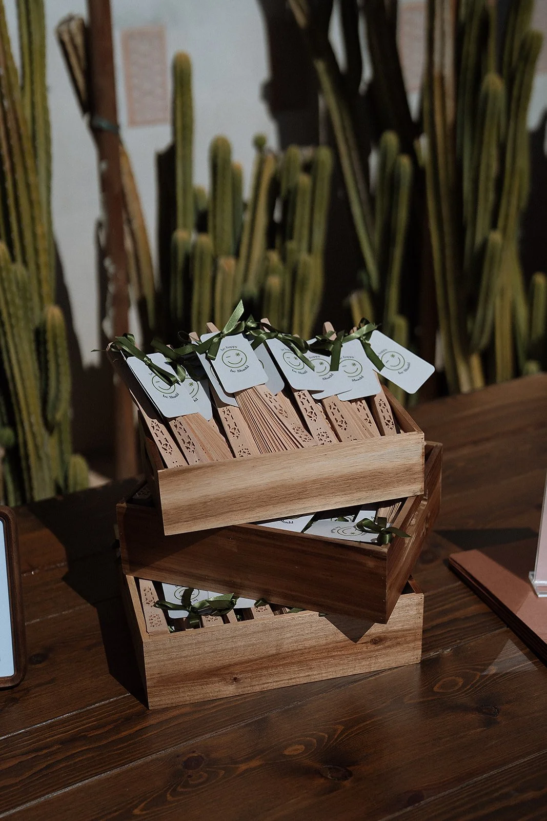
With our venue and the branding locked in, it was time for the fun part to start. Starting out with save the dates and invitations- I went in with an open mind here as I’ve never designed for a wedding before, let alone my own, and I truly just played. It felt really good to just try different things and see what works and what doesn’t and what I liked and what I didn’t like. Once the save the dates and invitations officially went out, everything else naturally followed. We thought of almost everything as a branding moment for us to share something so special with our closest friends and family from photo ops to signage, to hand fans, to menus and place cards, to our own sticker machine. It felt like the opportunities for branding were endless and it was so special to be able to design and create this all with my husband.
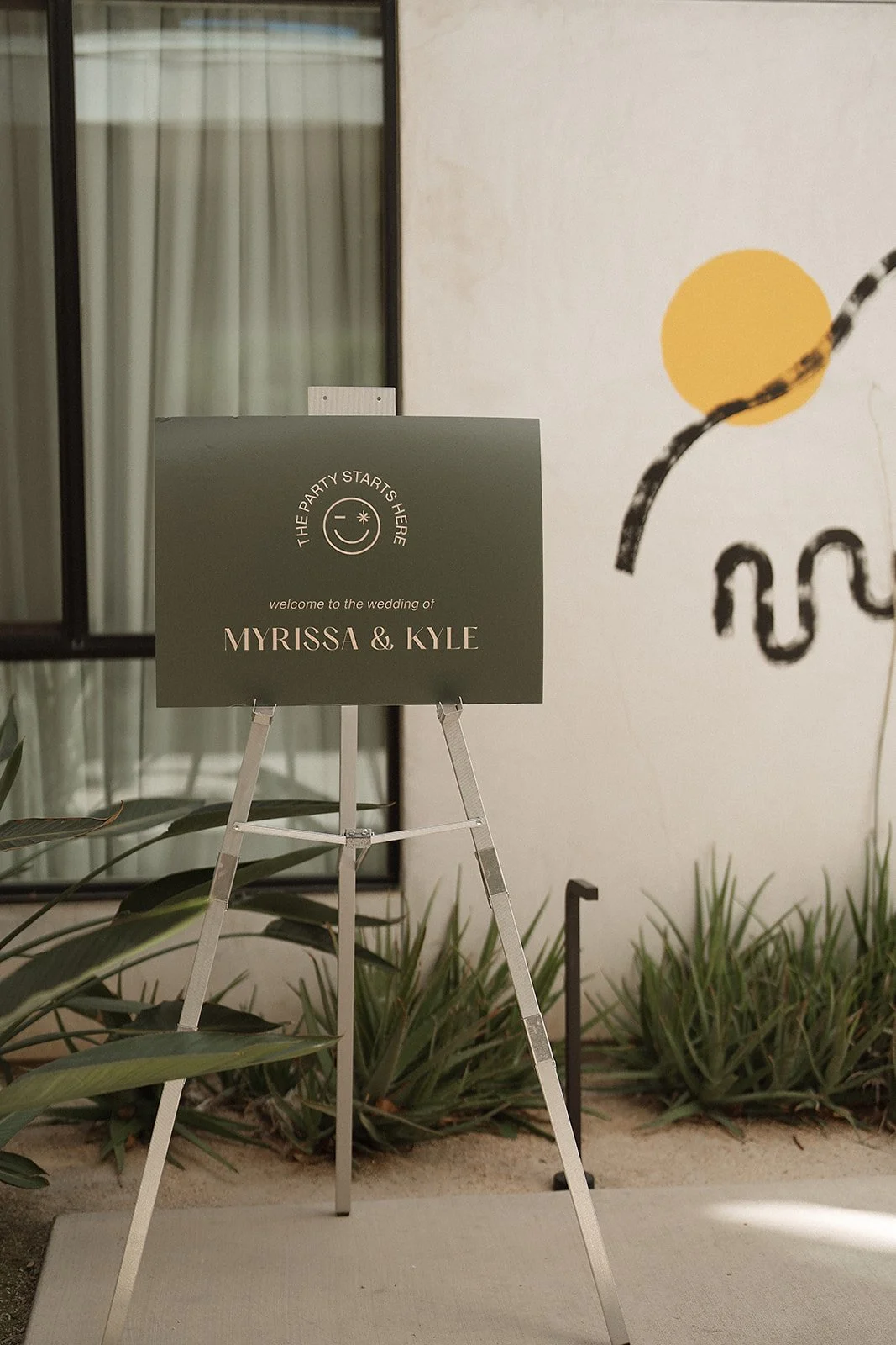
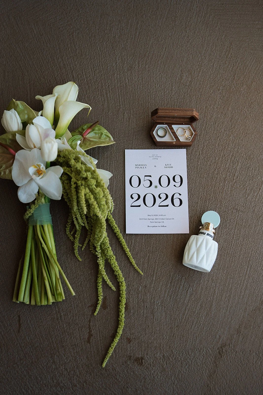
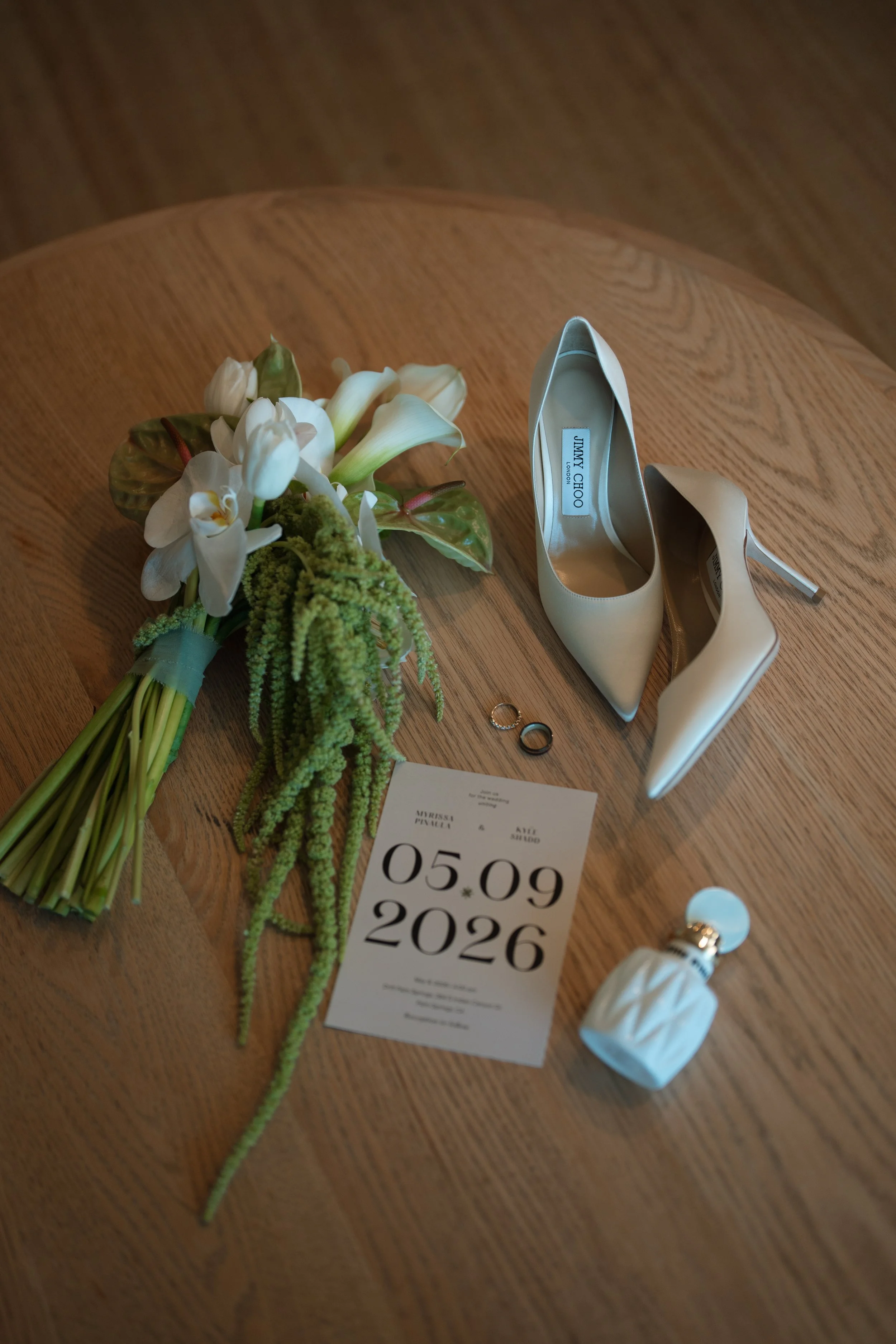
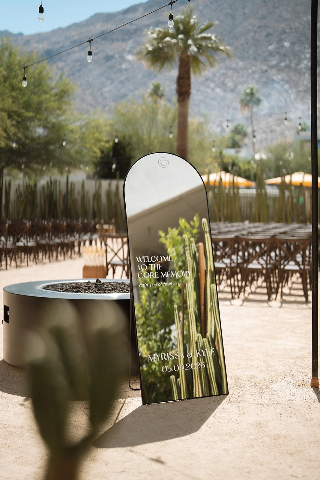
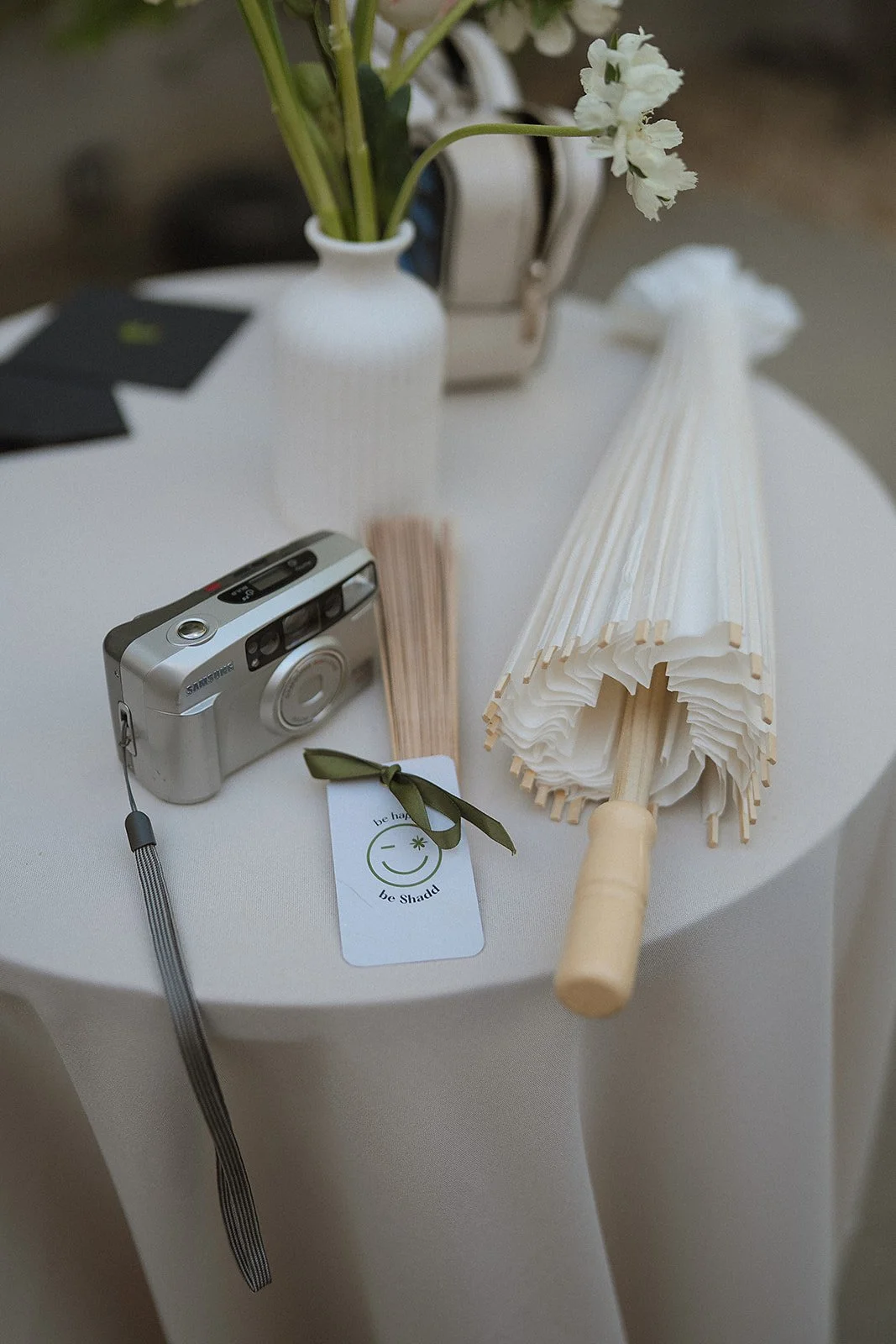
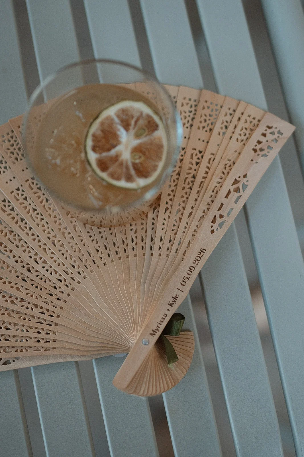
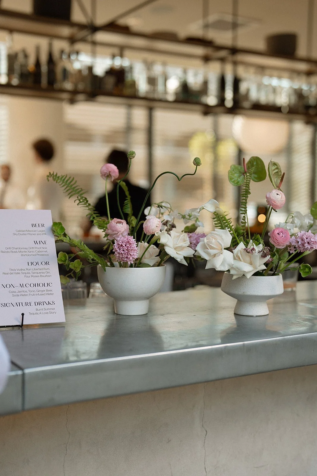
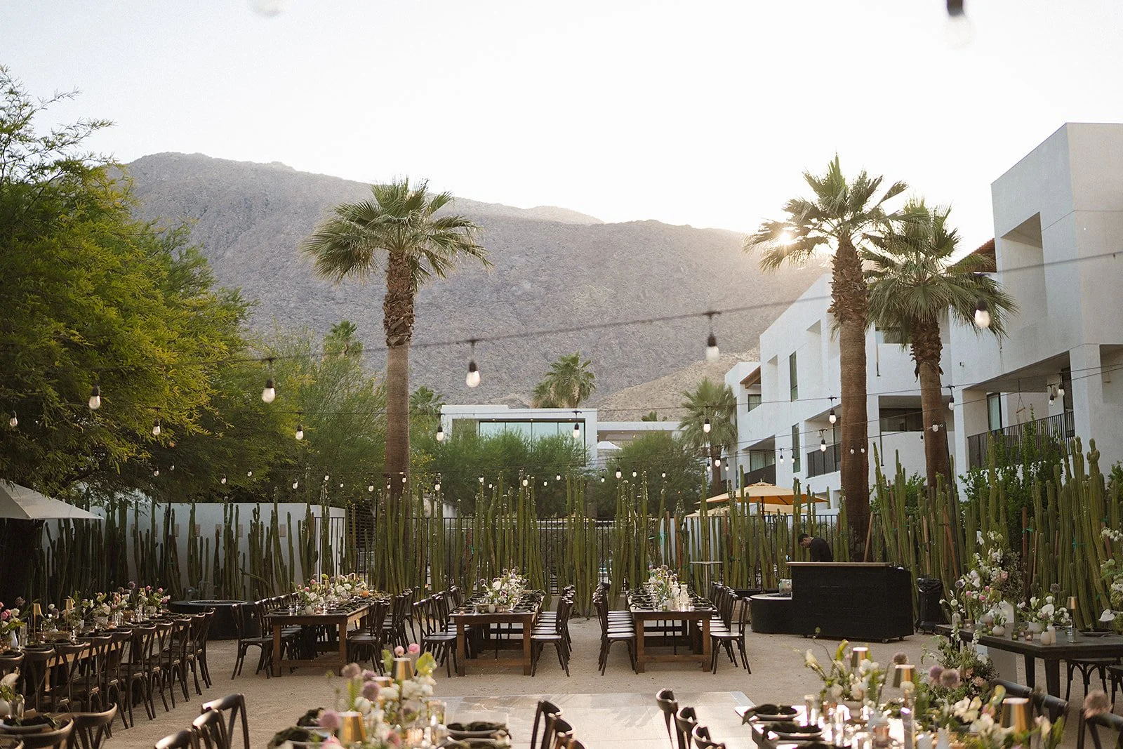
In-Situ Brand Moments
Photos of some of our branding moments on our special day captured by Hollow and Grace! Huge shoutout to our vendor team:
- Planning: Serenity Bloom
- Florals: Irises Designs
- Photo & Video: Hollow + Grace
- Sticker Machine: Hive Quarter
- Venue: Drift Palm Springs
- Content Creation: Kikki Content